Modern Technology: A Not So New Paradigm for Creating Art

“It’s not what you look at that matters, it’s what you see.” ~ Henry David Thoreau
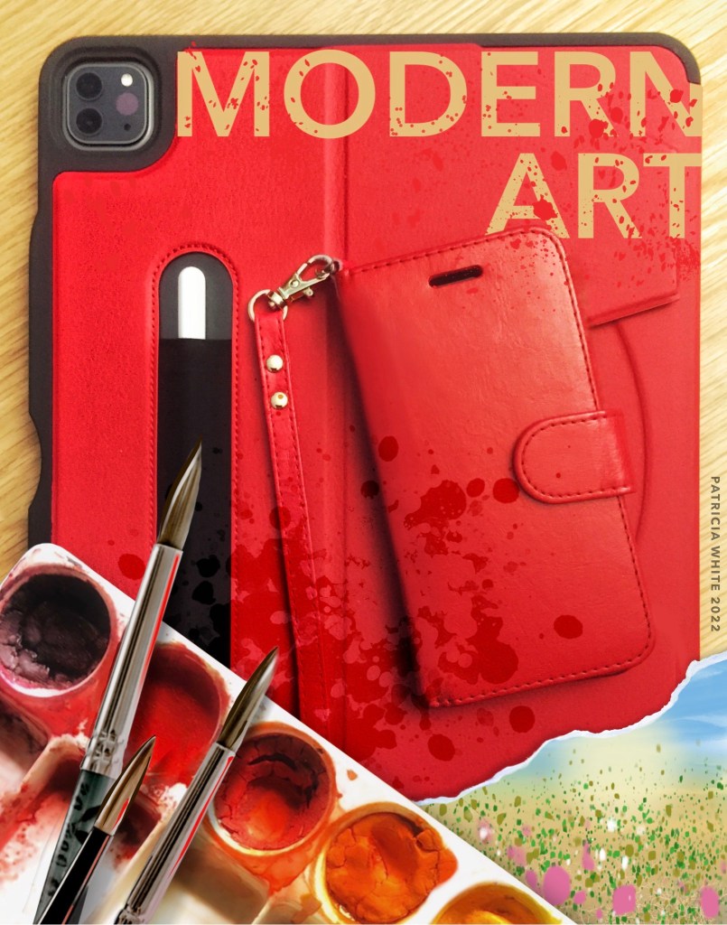
Modern Art 2022

I resisted creating digital art for a long time. I was wrestling with whether it was ‘real’ art if actual materials were not used. For example: paint (acrylic, gouache, watercolour), pastels (soft and oil), graphite, coloured pencils, as well as other materials.

Although I still mostly work in analogue art (click links to see a couple examples: linklinklink), as arthritis worsens in my hands and arms, I might work digitally. At times creating concepts to be reproduced later with brush, paint and other materials.

I created this 2022 screenshot of some of the devices I utilized (iMac not pictured) to try out concepts as well as to create fully digital works. Note: a flat-bed scanner is also a useful tool for incorporating analogue work.

Procreate is one of the applications I find most useful, along with Adobe Fresco and, for a time, the Affinity Suite of apps, though I have not used them since they added ai (artificial intelligence). Call me old-fashioned but I want my art to be my work and mine alone, not taken from other artists without their permission. I ran a design agency for many years and we took copyright issues seriously. Nothing has changed in my attitude to using work that is someone else’s, without payment and/or attribution.

Thanks for reading.
How do you like to work with new tools?

Leave a message in the comments.

All artwork and creative writing is Copyright © of Patricia White. No use of this content or concept may be used without the express permission of the artist/author.
Trying Out Daler Rowney Aquafine 24-pc Watercolor Travel Set

“Painting is just another way of keeping a diary.” ~ Pablo Picasso

I recently purchased a 24-colour travel set of Daler Rowney Watercolours made from high-quality organic pigments that deliver rich colours with premium mixing ability, with long-term resistance to fading, Made in England.

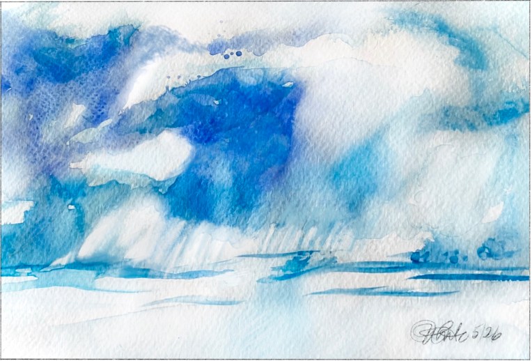
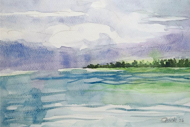
The pigments are, as advertised, strong and vibrant. The blue cloudscape to the left is my first try and I found it to be overly saturated.

Next, I resolved to load less paint on the brush and build up lighter layers that are more transparent as I would normally work with watercolour paints.

The second attempt was better but felt like I was still finding my way through the strong staining power of the Daler-Rowney watercolour pigments that continued to feel too heavy and a bit muddy.

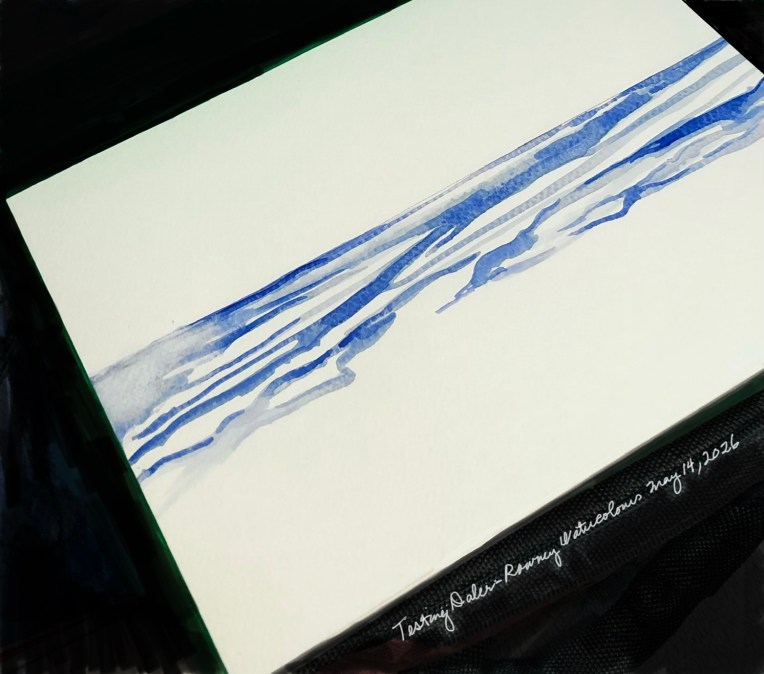
The third exercise was painted with a 3/4” long #6 rigger liner brush using Prussian and Ultramarine blues, dragging the brush in long, flowing strokes.

I was starting to feel like I was getting the hang of these materials. 😉

Have any of you used this brand of watercolour? if so, what are your observations, experience using it in practice?

Thanks for reading.

All artwork and creative writing is Copyright © of Patricia White. No use of this content or concept may be used without the express permission of the artist/author.
A Tiny Pencil and Watercolour Daily Sketch

“The landscape thinks itself in me, and I am its consciousness.” ~ Paul Cézanne


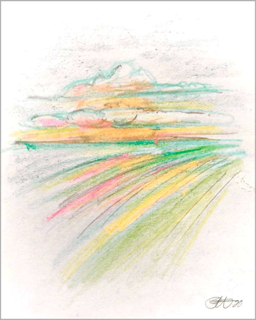
‘GreenScape’ is a quick colour study from one of my older sketch books. For many years I have tried to keep a habit of doing art every day. Even if it is just a tiny sketch like this imagined landscape scribbled down in a small 4” x 5” notebook (one of a several drawing pads that sit on my bedside table). These studies can inform colour combinations and suggest forms to use in larger compositions.

Keeping a colour journal, as well as a features collection, can help when a larger future work isn’t quite working. Flipping through these binders and sketchbooks can give new insights for where to go in the new work.

The initial sketch, shown here, was drawn with a common HB lead pencil, with a few brushstroke washes added using a small Cotman Water Colour Sketchers’ Pocket Box.

All artwork and creative writing is Copyright © of Patricia White. No use of this content or concept may be used without the express permission of the artist/author.
Watercolour Salt Experiment: Mixed Results

“Passion is the salt of life…” ~ Françoise Sagan, author.

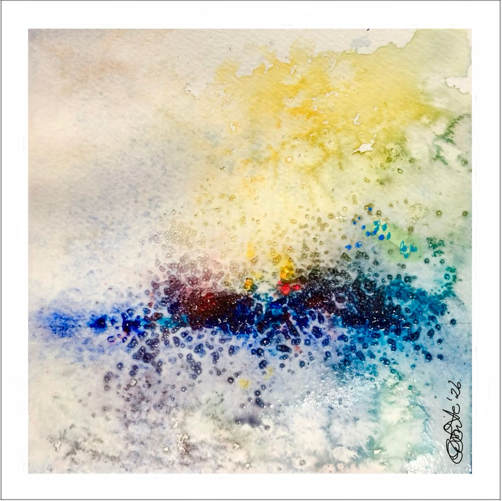
A small experimental piece to try out materials, techniques and colour combinations.

In this approximately 6” x 6” watercolour, I dabbed some beads of Daniel Smith tube colours (Yellow Light, New Gamboge, Pyrrol Scarlet, Quinacridone Rose, French Ultramarine, Phthalo Blue) midway down the sheet. Next, I floated clear water up to the paint, tipping the board to flow the colour into the corners of the space. When still wet, I sprinkled some table salt in a couple spots. Some lovely cloud-type and crystalline shapes formed. Though the salt did not disperse as much in later stages. Perhaps the paint was too dry by that time. Also, the salt didn’t rub off very well after dry. I expect it will work better with thinner washes.

Lessons learned include: a) work faster before the paint dries too much to easily flow; b) use a coarser salt and apply it where there is more water on the sheet; and c) put paint on in thinner or smaller daubs to start.

What are your ‘go-to’ subjects, materials, colours when you just want to doodle?

Art created 3/19/2026.

All artwork and creative writing is Copyright © of Patricia White. No use of this content or concept may be used without the express permission of the artist/author.
notes app drawing: SightLines

“Vision is the art of seeing things invisible.” ~ Jonathan Swift

Another of my daily scribbles using the simple drawing tools offered in the Apple Notes app. Edited in Procreate on my 12.9” iPad Pro. I dubbed this drawing “Sightlines“ to represent the volumes of information that we are taking in and processing every day. This is a particularly virulent time in history, politically, environmentally and technologically. Trying to keep up with the latest news while dealing with the vagaries of life can be overwhelming. We artists and writers generally internalize the environment around us and these events can appear in our work—often unconsciously. How do current events affect your work?

The chronic arthritis in my shoulders complicates the making of traditional analog art. On days when it is particularly problematic, I often draw on my iPad Pro in apps such as Procreate, Adobe Fresco and other dedicated painting apps. Lately, however, I have been enjoying the simplicity of the Apple Notes app drawing tools as a vehicle for creativity. I generally use the Apple Pencil for navigating around the tablet to cause less stress on my hands. In this drawing I primarily used the Notes app pencil and crayon tools. If you are dealing with arthritis or another challenge, what are some ways that you continue to be able do your creative work? Would love to hear from you in the comments.

All artwork and creative writing is copyright ©️ of Patricia White. No use of this content or concept may be used without the express permission of the artist/author.

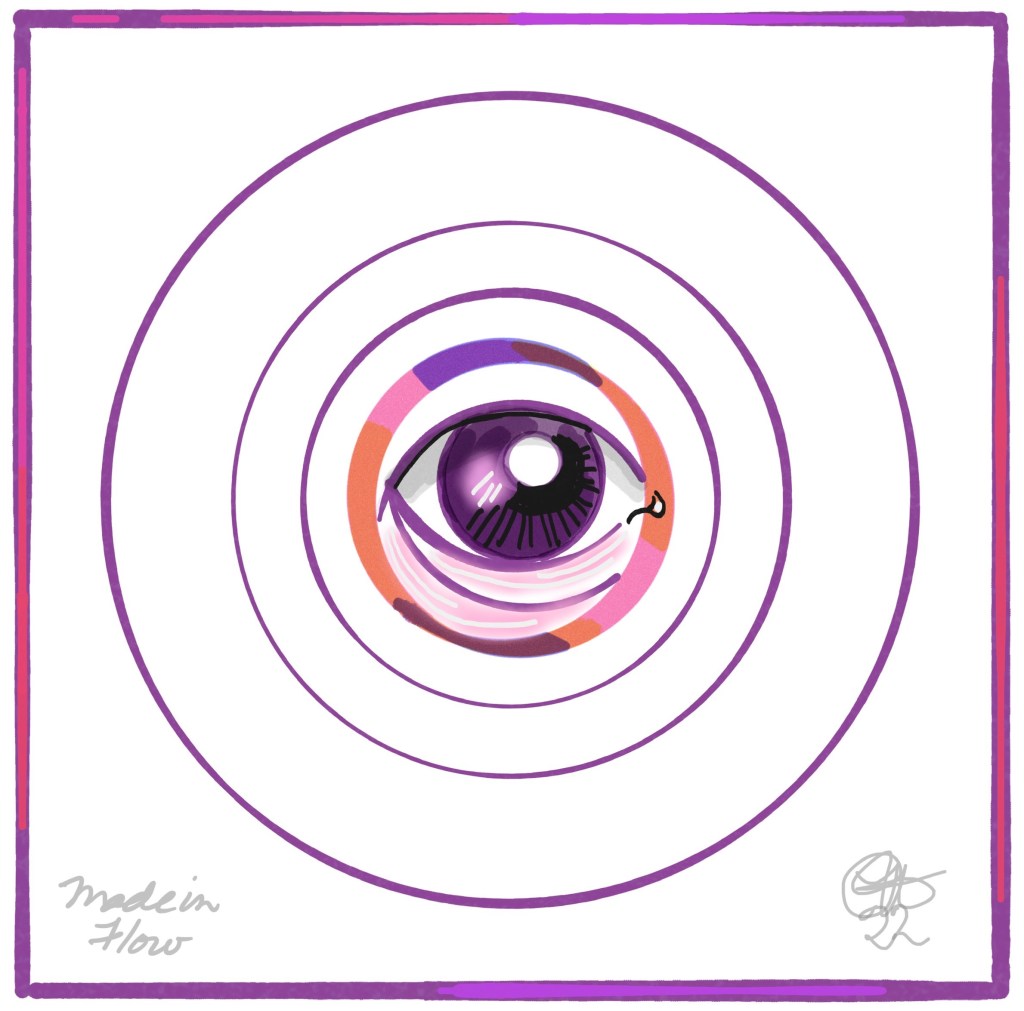
concept development with MOLESKIN’S Flow App

In addition to my fine art work, I also do graphic illustration. So, I’m always looking for ways to quickly sketch out a concept or idea on my iPad Pro before it flits out of my head. These concepts are often used to provide direction for analogue works or digital brand development. Digital drawing apps, such as the native Apple Notes, or the newer Freeform apps also have sufficient drawing tools to scribble down a thought or image idea.

Ran across this concept from last year when I tried out the FLOW: SKETCH, DRAW, TAKE NOTES APP, which is part of the Moleskin Studio trio of applications, and found the tools to be quite good for marker rendering, pencil sketching, etc. The shape snapping feature was particularly useful for this quick concept. March 21, 2022

Check it out: Moleskin Studio

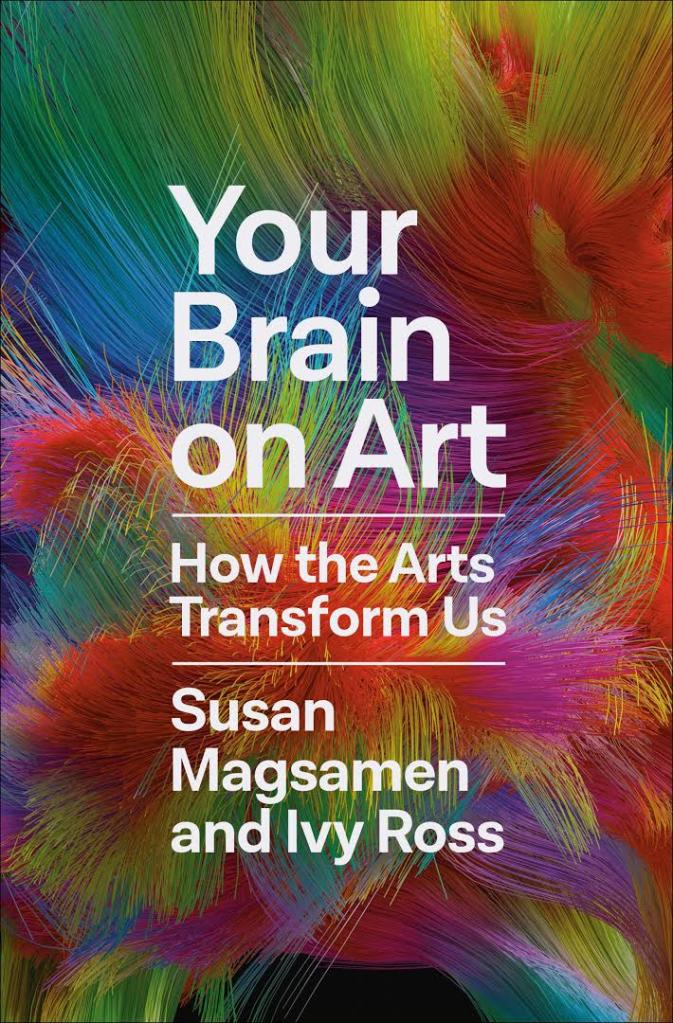
CREATIVE INSPIRATION: New book based on neuroaesthetics

Your Brain on Art: How the Arts Transform Us by Susan Magsamen & Ivy Ross

CHECK OUT THIS ARTICLE IN THE WASHINGTON POST. IT STATES SO MANY THINGS I BELIEVE ABOUT ART. For me, art is a ‘MUST’ do activity. It keeps me CENTRED, expresses concepts or thoughts that otherwise may disappear into the ether. It KEEPS my AGING HANDS and brain dexterous. I create EVERY DAY. It may be a sketch, painting or other VISUAL art; or WRITING a chapter in a story or development of a new character; it may be slapping together a COLLÁGE from found materials; or knitting a row or two on a NEEDLEWORK project; it might be FOOD preparation or INVENTING a new vegan dish to sustain our health. I create for the FULFILLMENT of creating SOMETHING from NOTHING .

The author states that “Art is NOT a LUXURY for our downtime, but an important CONTRIBUTOR to physical and mental WELL-BEING”, says Susan Magsamen, co-author of an upcoming book on the new field of neuroaesthetics, which studies the brain’s responses to art. Book: This is Your Brain on ArtPenguin Books.

To Magsamen, founder and executive director of the International Arts + Mind Lab at Johns Hopkins University School of Medicine, her artistic pursuits are ABOUT FAR MORE THAN HOBBIES. “I need it for my SOUL and my HEALTH and my SURVIVAL,” she says. “It’s not a NICE to have, it’s a HAVE to have.”

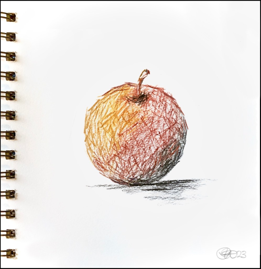
Sketchy Coloured Charcoal Apple, FEBRUARY 25, 2023

“The sweeter the apple, the blacker the core…” ~ Dorothy Parker

I’ve been using my DAILY PAINTING regimen to experiment with new materials, rather than working in just one medium or style. When testing new products, I generally draw a familiar subject so I only have to think about how the materials are working.

LOVED working with Derwent’s Coloured Charcoal pencils (included in their Derwent Sketching Collection).

Used a limited palette of Brown Ochre 5700, Terracotta 6400, Peat Tinted Charcoal TC18 and Burnt Earth Tinted Charcoal TC19 but I will definitely be checking out adding a larger range of colours.

Artwork Copyright Patricia White, 2023.

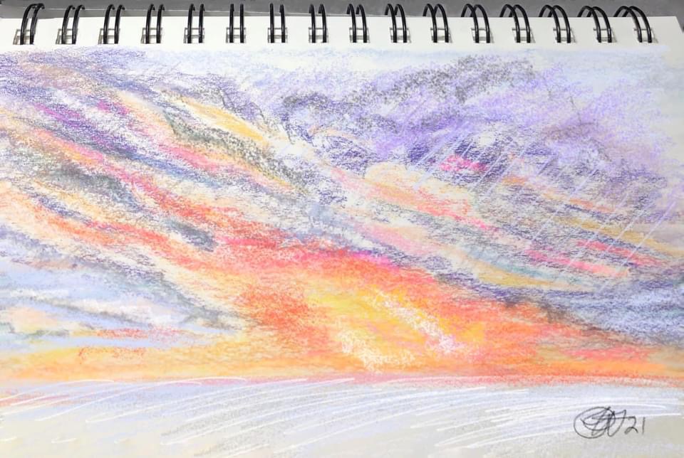
Brenda’s Sunset

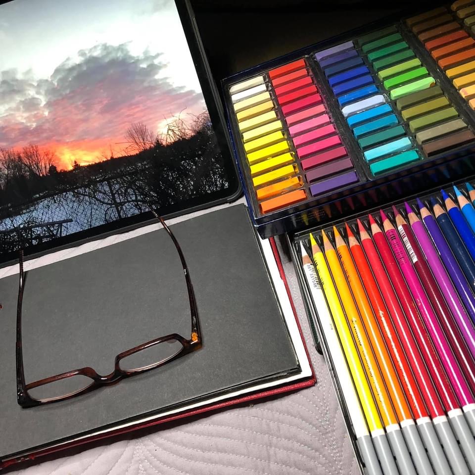
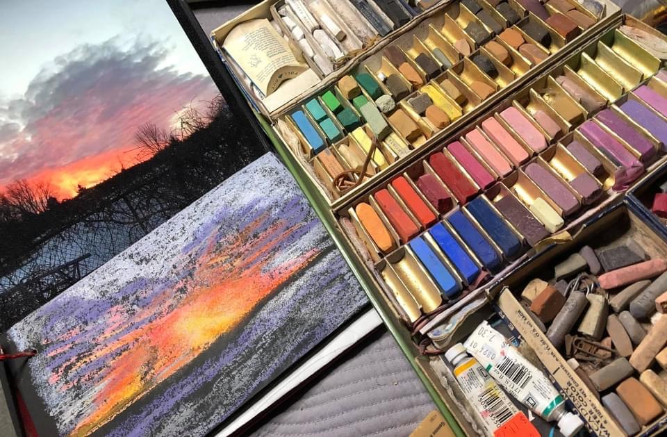
A friend took a photo of a stunning sunset a few days ago inspiring one of my morning pastel sketching sessions (see photo reference displayed on my iPad Pro in pic 2 below). One of the sketches is on 5.5” x 8.5” Strathmore 400 series fine tooth 60 lb. dry media paper using Faber-Castell soft pastels and a set of 24 lusciously creamy Stabilo CarbOthello pastel pencils (really need to get a full set of these babies. They’re magnificent). Also working on a second ‘in process’ drawing on a more unforgiving black photo album stock using a tray of well-used vintage pastels (still need to add the tree line to the black-papered version after spraying with workable fixative to enable an additional layer of chalk).

Artwork Copyright Patricia White 2021.